Showing posts with label Character design. Show all posts

4 Oct 2010

The Search for Shapes

This week's asignment was to try and think about our character designs, but only in terms of their shapes. As posted previously, shapes define the feel of the design so this was an atempt to try and capture the right feel for the appropriate design ( vilain's, sidekick's  or hero's) and to pick some of them to develope further.
Again, my words were Monsters ans aliens.
Also, this is the logic I'm following:


30 Sept 2010

Character Design Lecture 2 : SHapes in design

 Diskussed By J.J. *Jolanta Jasiulionyte*

The second lecture of character design covered the importance of shapes in design.
Shapes are important in a way it can evoke a particular feeling and perception of the character.
To give few examples,circle is used mostly to create a feeling of security, harmlessness and cuteness. Its only because in our life the shapes that are round have this meaning. For example babies.

Contrary to that triangles are used to create uneasiness and a feeling of danger. Like Justin Wyatt explained, its deep in our subconscious – man is scared of sharp things and understands it as potential threat.


And squares should evoke a feeling of strength, reliability and security. Just like architecture is stable , so can  a design look,  made using lots of firm squarish shapes.

But the true designing begins when one try’s to employ a variety of shapes to convey the personality of the character. A great example Justin Whyet gave us was Obelix’s design.He’s a gentle giant, so the two main shapes used in his design are square for the upper part (firmness) and a circle for the lower part (soft and harmless).


After being  acquainted with shape purpose in design we were given a task to draw few designs using variety of shapes.


To see more examples of  theory application for character designs done by J.J. *Jolanta Jasiulionyte* go here

22 Jun 2010

Bird's Design Sheet: Front, Back, Side


This is the most resolved design of the bird in his primar stage ( befor becomeing a lantern) Full resolution of how a 3d model would look. Now I'd feel confident modeling it.

18 Jun 2010

The Bird


After..now two weeks of visualizing and roughly a week of drawing today I got to first time see how actually the bird is looking. I have to admit, this is perhaps the first design that really has a lot of likeness to what was in my head. Some changes , of course, will take place.

Also there's still the side and the back view left to be drawn. But this was the hardest bit.

So as you may notice, the bird looks like a ship and is made out of ship details. But that was, as I mentioned, my intentions. After figuring out the proportions ( where I researched the variety of birds), how its going to be constructed (to get a good idea of that I researched bird's anatomy, contemporary architecture and the "what's out there", in particular - Howls Moving Castle ( Dir. Hayao Miyazaki, 2004)) what left was building a ''puzzle'' . The bird looks like he is clayed together from various bits of ships and in general, from leftovers ( I think I should make the bird asymmetrical to make the idea he is made from leftovers even better pronounced..).

Having figured out the design of the character I can go and find what his environment is like.
Next week, my last one here in Rochester :) , I'll try and create the concept drawings of the environment and the world of animation in general.

17 Jun 2010

Bird's and Bird-Lantern's proportions and structure guidelines.


After listening Alan's comment I decided to tweak few things. He suggested to first research birds anatomy and all the 'hidden' bones they have because that consequently might affect the design work. And it doesn't matter if its a cartoon character.
In my case the bird is somebody's made model/sculpture, so I imagined it's moves restricted ( penguin-like walking for instance), On the other hand if it were for animating it later , I'd still need to express his thoughts and feelings somehow. I thought the tool for that could be his head and eyes and his wings, which , I read somewhere, should be considered as additional pare of eyes :D ("Hands are like extra pare of eyes in animation "). So instead using the blocks for wings, like I planed, I went for more real-like construction of bird's wings.
Also changed the proportions so both bird and bird-lantern would look slightly better

21 Mar 2010

Coat's und Umbrella's Character Design


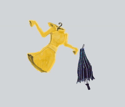
Animation is going to be about an umbrella who is lascivious over the women rain coat. So I have adjusted character design according to the story.
I've designed a raincoat which doesn't lack of female body shapes. I chose yellow for it is a stereotypical colour of raincoats.

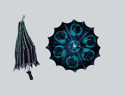
The umbrella itself seemingly has two different designs . The first one is before the moment he sees the raincoat - its modest and quit bland , like Bill Plymton - a notable animator,who created 25 Ways to Stop Smoking points a sensible note of why should characters be designed that way:

"I think characters should be ...really normal; sort of non-discript in his characteristics, because when something weird happens to him, when he's excited.. there is a real contrast. That's the secret of good animation, the movement between something that is sedate to something that is extreme"

The modest version of umbrella has coloured contours, but the shape and the type of it is rather choppy and should remind a ruff and old umbrella for a man.

But than in the story umbrella gets excited after seeing a very sexy raincoat and tries to impress her in a way very similar to how birds try to impress mating partners - by their charming looks and mating dance.

And I suited that by giving some extra patterns and colours to the "ruff-looking" umbrella.
I got the inspiration for patterns and colours after seeing peacocks and bird of paradise mating dances. ( The blue colour I saw in the bird of paradise never left my mind :D )

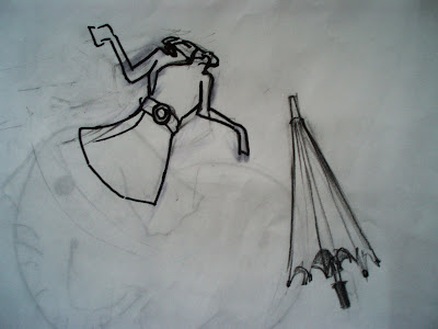
I still left a question mark about the design of the characters. I might go for simplifying the design, purifying from unnecessary details.

12 Mar 2010

Getting to Know Characters


Just started drawing to understand how the shapes of these objects work and what causes difficulties in bringing clarity. So far I think the raincoat could be more simplified. as well as umbrella lacks of 'manly' appearance.. I'm still looking for my art direction as well.

27 Feb 2010

Character Emotion Sheet


After doing thumbnail sketches of my story I saw what main emotions characters experience, so to bring clarity to my story I thought it would be helpful to draw out those different states .
Though the good emotions such as happiness are still mixed with their prides - characters are happy for others misfortune.

Character Sheets (Coloured and two sided)


I did Characted design previously, but I didn't colour them completely and din't present them from two different sides. So there it is.

21 Feb 2010

Main characters

Fynally the characters meet. I hope their personalitys could be read already.
It was great fun :D

Character Design: the Development and the Resolution of the 2nd Character


When I was creating the design for... the fat one ( I don't know how else to call him :D)
I wanted him to be like a little intensely silly-angry character ( the french-looking is more arrogant) .


This time I equipped him with a pilots hat , it's just how it plays in my mind :D and its also very expressive - like eyebrows or mouth - so the hat becomes very handy as well :)
the pilot glasses made him look ..cute and friendly, but then i made it in a slightly oval shape. That gives the more mean look.

Why the fat one is a tight rope walker? well.. he has very long feet, that compensate his body dynamics :D ( that's also opposite to the french guy)

17 Feb 2010

Character design: refining the design


I decided to thoroughly upload each step I take ( there are those INDEED helpful comments).
will be posting shortly. That is after recovering from "The Romanticism" .. :/ :D


Oh, so OK. I decided to equip my character whit mustaches, since ... eyebrows.. no, I didn't like the eyebrows . They didn't suited with this design (to my mind) But mustaches are equally expressive - I can imagine them zig-zagging when our French-looking guy is displeased with the fat-one's actions :D

And yes.. sketching the script. My... how I want to start with that :/