13 Mar 2012

CAPS: Research for Fashion Photoshoot: i-D

 The Magazine:
i-D is a British magazine dedicated to fashion, music, art, youth culture and
 different issues around the central theme of identity. i-D was founded by
designer and former Vogue art director Terry Jones in 1980. Over the years the
magazine evolved into a mature glossy but it has kept street style and youth
central to every issue.

 
Tipped on its side, the "i-D" typographic logo reveals a winking smiley. Most issues of i-D magazine have featured a winking cover model.


The magazine is known for its innovative photography and typography, and over the years established a reputation as a training ground for fresh talent. The magazine pioneered the hybrid style of documentary/ fashion photography called ‘The Straight Up. At first, these were of punks and New Wave youth found on English streets and who were simply asked to stand against any nearby blank wall. The resulting pictures—the subjects facing the camera and seen from "top to toe"—are a vivid historical documentary photography archive, and have established the posed "straight up" as a valid style of documentary picture-making.
 

Photographers :
  • Nick Knight,
  • Wolfgang Tillmans,
  • Juergen Teller,
  • Terry Richardson,
  • Ellen von Unwerth,
  • Kayt Jones 
Analysis for Preperation:
The issues have developed but retained 'core mantra' : 'Originate, don't imitate'

Essentially it seems that there is a dominant light from one side and slightly from above, which is modeling the shadows. For shadows are gradient and soft, it must've been soft box light or beauty dish.  Also, face is lit the brightest, perhaps using white or golden reflectors.

The background is not overcomplicated, and grey or white colorama is used. Some pictures use ‘screen’ or postproduction techniques to partly obscure the image. Most of the times, models are dressed in bold clothing,often limited to black and white pallet. 

It can be noticed that the image is complimented with lots of geometrical shapes to tie the image together (For example a reflection of the mode on the wall, which reaches to the end of frame) and direct the eye of the viewer towards model’s face ( hand towards the face, décolleté as a frame for the face).

To keep the photo-shoot guided, I have gathered some pose references for the model from i-D magazine history images. 


 The pose references and Example images of i-D issue work as moodboards for the fashion shoot


To end the analysis, it seems that i-D’s shooting style and approach resembles that of Brassai’s : full of soft gradient light, tonal values. I’D’s photography quite often goes with desaturated or almost desaturated imagery.


  And one particular image of Edward Steichen:


12 Mar 2012

CAPS: Product Shooting for Toys Brochure

Given the task to prepare several images for Toy company’s brochure had set particular challenges. It has to be visually engaging and appealing, and fit within commercial shooting standards.
 
To reach this , experimenting with product’s placement, lighting and techniques of postproduction was put into practice.
Lighting and placement:

For clean aesthetics and focused directing white colorama was chosen for the shoot. This has lead to a very ‘light’ , unencumbered images.


Placement of the product was put into a careful consideration for if the product was placed incorrectly, it  caused some  visual information loss. For example bear-toy and colorama had closely same tone and chroma values , therefore bear almost disappeared in images.


Donkey-toy was  to be used for contrasting.


 Another example was tricycle’s lamp: when facing studio lights directly they would bleach out any texture of the tricycles light bulb.


When Light angles and composition was set , this was the outcome:


For Lighting there was two lights used with one white reflector for softening of the shadows .

Postproduction:

Having reached 90% of the quality during the shoot, postproduction asked for minor tweaking of exposure, shadow intensity and colour tints. Some images benefited from slight increase of sharpness, clarity or noise values, for emphasizing fur on stuffed toy’s.


And the rest of images :


10 Mar 2012

Vaivas Body Modeling Progress

It is nearly done and ready to be UVd and taken to Mudbox for fine details.


These stills are little bit dated, as I have talked to Alan and done some tweaks to her crown, face and general topology.

6 Mar 2012

Nudes of March

This time the session was particularly interesting for we were asked to interpret an emotional state in different visual languages. So cool! there's an indication to what was the feeling on the corner of every image. Also, some 2min. poses at the end of the page.


Sketching out Vaiva's Body Model

Progress in modelling Vaiva's body. So far it is only a sketchy map out, with only hands being modelled to the fine detail.
This is helping me now to see how 2d designs translate in 3d. I see which areas need to be more punchy.


Detailed modelling is on its way.

4 Mar 2012

Vaiva's Head Model Turnaround

Vaiva’s head model  consists of head mesh, hair and the crown.


There are hints of chicken-like anatomy in her facial features: elongated sharp nose, round big eyes. Also royal grace is another intention: long thin neck, small chin in an overall thin face, but at the same time her face doesn’t lack volume in cheekbones or the hair for contrast. With some of the asymmetry in her model it is aiming to break from the “tidy’ harmony, for the character is of a twisted kind.

29 Feb 2012

With Mudbox there are options to pose the character using essential tools of painting selection for moving and then using move tool. Quite simple and quick results. When the model is in the correct pose, sculpting the asymmetrical details can take place. 

'Laumikas' Model

Time's come for production. This is the model of 'Laumikas' a bag of straw out of which a dwarf-child grows.


Original Concept was :

24 Feb 2012

Pixie's Silhouette Test and Colour Pallete Indication

This is the  tidying up of the concept stage: indication of 'The Baltic Pixie' colour palette and the shape reading sheets. It is simply a more formal presentation images I haven't included before.


The palette of 'The Baltic Pixie' is essentially based on complimentary colour system: the character is predominantly green and the background is a complimetary to it,  violet/purple. All other colours of the wheel are also used, but in lesser proportions to make make the workings of complimentary colours more sophisticated ( otherwise the relationship would not have the  'gusto' to it).


I've said that expression sheets are next to come, but after some though I've decided to film the reference material beforhand creating the sheets. In this way I'll avoid generic results.

23 Feb 2012

Storyboard Script, Adjusted Animatic and 'Laumikas' Concept

Tidying all the loose knots: storyboard script for my own convenience when further going to animating. Also it shows the planning of screen time, concerning the variety of shot structure.


I have revisited the animatic and added more panels for better flow and clarity. Shouldn't have changed that much in its essence


Lastly, in the animatic we see three other objects: the moon, the rainbow and the

'Laumikas, a sack of straws out of which a dwarf child grows!'


22 Feb 2012

Blueprints for Vaiva's Character

The turnarounds of Vaiva show  her construction on couple of levels: her body and dressing. Particularly challenging was the side view of the body, side of head and skirt for it is the profile view which uncovers the ambiguity of shapes in her design: the welcoming round shapes triangulating eventually to suggest her more feisty nature.( front view looks much more piecefull , but the side one sharp and wildly dynamic for example)
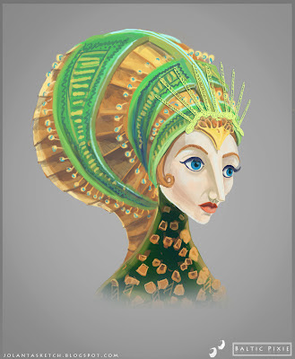


Her head drawings is a particularly subtle part, which’s characteristics can be hardly captured on blueprints and work instead as brute guidelines.


Another little upload I wanted to draw attention to was the title design for The Baltic Pixie, which I’ve created from scratch. It is supposed to mimic the feeling of a relatively primitive style of Baltic art.


Next in line , I'd say , are her expression and pose  sheets

Analysis of Aesthetics for Product Promotion

This post is a homework task for CAP (Commercial Application of Photography)
We are learning a lighting set-ups for glamour advertising ,

the image above is my attempt to present newly-resleased parfume
 

two soft lights were used to set up the lighting: one from the side and one from the back. Exposure settings were matched to the light measurements taken off the object surface
A , which work is discussed here is Pixpecker agency

A company working on advertising, photo manipulation, retouching worked on Beer “Svyturys” promotion.


The end result is a painted still-life. The scrupulously built set included a sophisticated lighting set up .  Stripes of coloured paper were assembled on one reflecting sheet so to give a highly controlled colour reflections onto the product.


Key features:

Soft shadows,
Rim/contour light,
Emphasized light from side  

The decision to present the product as a traditional media painting adds a feeling for the brand to be coming from a traditional point of view and therefore familiar.

Developing Project Branding


For the purposes of documenting the project  professionally there’s a need to have a clear branding. 

Logo,
Latest thought led to creating a logo of  original typography and using some reference for direction of Baltic ornament feel


 This was the initial idea, which eventually worn off, for its lack of original or relevant feel.


Lastly, the layout of documenting projects progress, which will be assembled for The Making of book.This particular exampleis also a character description sheet


With this layout, I'm aiming for clean simplicity and honest presentation of information.

21 Feb 2012

Hard Surface Modeling in Mudbox

Mudbox primary application is high-res sculpting, texture painting, and displacement and normal map creation, it is a great addition to the pipeline of character/environment based pipeline and works in a close conjunction to Maya. When comparing it to a similar-purpose program Z-Brush, Mudbox owns appreciation between Maya users, for its simplified interface, interrelatedness, brush assortment cut down to the essential 12-14.

This week’s tutorial was on hard surface modeling. The class was practicing on creating soldier armor.

Sketch of Soldier Armor, 1h

20 Feb 2012

Vaiva's Design Detailing : Face, Hands, Legs,

The decision was to move forward with the developed design without working out 'more excitting' ones, because, actually I the already created one is actually one which was needed. Not to go into too much detail, here is Vaivas close up of the Head:


Essentially, her portrait follows a composition of a spiral , starting from the head it goes all the way to the highlight of the pupils. Her facial features are combining both, typical baltic female's features ( bright blue eyes, very defined cheek-bones, pale skin, blond hair) with those of a chicken ( pointy nose/beak, very large pupils and so on). In general I was aiming for a 30 year old women, both inviting and chilling at the same time.


Her hands are more like tools,  for the purpose of coming the flax, therefore, they are bare to the stone-like bones.

Finally, after receiving some spot-on feedback from Phil and Charlotte, I went back to fix the rooster-like feet. Now they're  following the design language of hands.


Over all, I think these improvements and further developments seem precise to the vision and fulfil the needs of Baltic Pixie (Laume) character. Still in development are the turnarounds.