14 Nov 2010

Narrative Unit Week's Progress

Its this time now, when juggling with few projects becomes more and more challenging.. So this week I worked on Toy’s poster/ package design. We are using the texture to tell the story. So here are the two versions Harpo poster’s. One o a common cheerful-looking toy, another when he’s being neglected .


Also studio reaches to create impactful sets wit minimum time/resource expenses. So best solution was to use matt paintings. Near in the future I should post the stills of city set finished.


And it was about time to start working on scientist character I’m responsible for. Alan’s tutorials were a life saver, though still I’m not rushing myself with this, I just don’t want to struggle in the future because of the mistakes made in the very early stages of character’s pipeline. 


13 Nov 2010

Fully Textured Characters, Resolved 4 View Turnarounds and Props

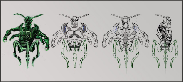
I believe the rendering of characters is pretty much finished. Here I post sidekick's and hero's concepts. Villain's finished concept was posted previously.

 I retouched sidekick's shapes to be  relatively clear rather than suggestive as before, also added textures for wings and eyes.


To paint hero took awfully long.. Definitely what I haven't expected.. It was because of his furry texture. I had to resolve  body hair as well as design props which were  intended for him ( I just forgot they were still  missing :/ ) 


That's the shield he carries with him on his back. It says.. . Well I don't know what, I don't speak in that language ( fictional that is). But I believe something epic.. :D


Last week I've posted the turnarounds, but mistakenly thought it's only necessary to do 2 views, so here is the added views for each one of them . 


What’s left is expression sheets, maybe some poses if there’s any brake in-between other two projects we have. I’d like to draw suggestive concepts for the two world environments. I know we have a lecture with Justin about it. But we’ll see...

11 Nov 2010

Character's Pipeline in Maya 2: Modeling the Head

This week's task to model the head was most helpful. Before having no clue how  head's geometry should be organized now I could step in to modeling my  own character with confidence, I believe. Looking forward to fully preparing the character for animation by completing UV layout, rigging and skinning tutorials.

9 Nov 2010

Them! 1954


Them! Was one of the first atomic age films which  success led to many copycats including Tarantula (1955), The Deadly Mantis (1957), The Giant Gila Monster (1959), Attack of the Giant Leeches (1959), the Godzilla franchise, The Attack of 50 ft Alien from Toyland (2010) and many others. “Soon after Them!, giant-everything movies were the rave(Justice, Chris; 2006)

It was interesting to discover that film is full of Biblical allusions and is comparing the dawning Nuclear Age to a Judeo-Christian apocalypse.    The film opens with a still shot of a Joshua tree and a young girl walking alone in the desert. 


Upon finding the ants, Dr. Harold Medford, speaks, “We may be witnesses to a Biblical prophecy come true and there shall be destruction and darkness that come of the creation and the beasts shall reign over the Earth.” 


A special note could be made about the use of sound effects. The ants’ eerie calls to each other were scarier than the physical embodiment.  Sounds, not visual images, foreshadow the monster’s arrival, adding further tension to the scene.

Also, the sets and the composition of shots are worth discussing. The crime scene sets would be an example. “Overloaded” with broken furniture, it still kept logics that before it was a tidy place, but someone powerful (or something) just destroyed it. Also most of the time characters are positioned in a way to “fill” three layers of the scene: someone in the foreground, couple just behind them and perhaps just one of the less important player in that scene in the background. Treating actors like another piece of  furniture. But most likely the feeling of depth is emphasized because the film  was ment to be in 3D.


Over all having seen the film a feeling came best described by Classic Horror film reviewer:“ some can deliver loads of fun and warrant critical acclaim. Them! certainly falls into both categories”(Justice, Chris; 2006).


Character Design Lectures 7 and 8

In the 7th lecture we were taught of the principals and swirling  ideas for approach  when  creating creature designs. The importance of   animal references, application of appropriate humanistic features and use of symbols, textures ect. were discussed. All is used to construct a creature audience would react to consciously and subconsciously ( For instance, As Justin pointed  Giger’s Alien has all the elements serving to subconsciously invoke a fright of rape in audience’s mind ).


The latest lecture all of us experienced a simulation of a real life scenario, where a group of 3 people were briefed to create 6 designs for a rebooted show.  The following two designs are for

Dr Zantus Kromozone;
Evil Scientist
Who delights in experimenting on other creatures but at the same time is squeamish himself. Lacks of display of emotions. He experienced an injury, lost an eye, but with his own capabilities improved himself by introducing a new eye capable of many new features like controlling the henchman.


A note from Justin was the design is too subtle and there's a far greater potential to go "over the top" with Scientist. Indeed only after drawing it I realised I've created a rather realistic portrait and have not designed a character as much.


Grok
Hulking henchmen, genetic experiment
Armor plated saurekian, with  instincts of predator and augmented natural advantages.He is controlled by the evil scientist  


It was a fairly good approach for that character as noted. Suitably non-human looks, good direction of shapes.
These were created in just over an hour. I'd guess it summarizes and  shows how well we pick up the conventions of designing a character  from all the  previous lectures as well  as what   creative  desidions were made in such a brief period of time.

8 Nov 2010

Character Sheets

Having figured out the basic construction of characters there is a next stage in designing them in full detail from side and front views at least.  General standarts include 3/4 view, front, side and back.

So here it is as follows:
( Character designer J.J. *Jolanta Jasiulionyte* )


Additional information sheet follows for the Villain to see the impressions he brings when fully stretched out. 

 
After the two views were finished it was only quick to do shape tests for each character.  


Again, had to tweak some of the hero's facal features. But to see the progression of design I upload a sequence of them.


Thanks for watching!

3 Nov 2010

The Horror of Dracula (1958)


Having read the original book, The Horror of Dracula to some point was a disappointment. The story was heavily abridged. Lacked perhaps the most spectacular supernatural elements described in the book ( shapeshisfting ect. )

Still, the most renowned British horror film Director Terence Fisher had something different from previous Dracula films to offer.

Previously, Dracula was gothic, black and white, with a thick Eastern European accent, and no fangs.” (Hodgson, Mark; 2009)

The Horror of Dracula seems more elegant, with some sophistication added to the characters, particularly to Dracula’s.  Dracula instead of feeling to be a weird (funny) creature (Bella Lugosi’s Dracula) , begins to feel overpowering monster, particularly for the weak and fragile women.
I did notice the heavy use of music. Contrary to contemporary films, here every note is perfectly clear: if we are to see the Dracula Appearing, musical tone would make it a dramatically powerful moment. Perhaps this fails to create the right impression on the audience these days (supposedly we should be wonder-struck). I’d guess it takes lot more subtle and sophisticated use of sound effects, a lot more abstract than a crystal-clear  use of drums, violin ect. 


For more reviews on Postmoder films as well as other films ho here

Also, please consider following my blog, full of creative visuals, CGI and reflective writings on film, animation and art theory. Cheers!

1 Nov 2010

Car Modeling Week 6

This week not many changes in model took place, just continue on adding details.

Character Body Modeling

After spending friday and monday I finally managed to get it done. But it was very interesting, and made lots of things clear. This is so usefull for our studio project where we'll have to moel our own characters.


31 Oct 2010

Character Design Refinement

Like two weeks ago, so as the last week's lecture, I’ve got advice and notes on all three characters.  No radical changes needed to be done, since the designs are pretty much in their refinement stage: tweaking proportions, adding details ext. 

So for the hero, again, I had to make some adjustments with his head's structure. Change nose and eye shape, add facial hair. Hopefully it’s working for the better now.


Sidekick pretty much worked as it is, just needed to add the jaw for more comunicative  facial expressions, and cleaned up the drawing for its clarity.

The Villain, as thorough out the whole character design unit, took the longest time to “figure out”. After changing  the head it became “more interesting” than body, also  seemed detached from it, so the advice from Justin was to add some “complexity” to the body.  


All of the changes were really necessary. Characters can be better understood when seen in relationship to one another.


I started working on the texturing. I had basic ideas about it  for each of the design:  hero will be furry, sidekick has a /dry/ thin bat-like skin, but the villain.. (There’s just something with villain’s design all this unit :D ) a great great idea came from Justin, and it was perfect, as soon as he mentioned it I saw fully finished design in my head ( Eurica! ) He said that villain’s design structure suggest he could be mineral-based creature, made of a see-through mineral.. Like.. He’s an evil alien, why not.  


I’ve gathered some Visual reference for each character’s texturing ect. Hopefully in next week I’ll be able to work on that more.


Oh, And I discovered I haven't uploaded show's synopsis , forgot :/  But here it is.

30 Oct 2010

The Uncanny House of Wax (1953)

House of Wax is a horror film about a sculptor who after being successful in his craft turned into monster killer. What led him to this was the greedy colleague who burned both the sculptor and his precious museum of wax people. After the accident he no longer could use his hands to create beauty, instead he’d choose a victim, murdered it and turned it to a wax sculpture. 

The first thing this film reminded me of, was the Uncanny Valley: Wax figures had so much likeness with real human and therefore it was so chilling to see, for instance their faces melt down in fire. Or a feeling of insecurity and suspicion, when one of the characters walks alone in the museum full of wax humans. As if a sudden movement or hit can be expected from every corner.To my mind it was where the most of horror in this film came from. 


The film was relatively a close remake of  Mystery in the Wax Museum (Curtiz, Michael;1933). And inspired some of the following films, one of which, quite obviously the new  House of Wax (Collet-Serra, Jaume; 2005) giving it the basic plot on which the  typical slasher film formula was then applied.

 
The film was wonderful with quite a few memorable moments. Particularly the theatrical chasing scene , when the monster tries to catch the leading lady. Or the entertaining but plain-obvious use of 3d effect with  ping pong scenes, as well as, mostly of all, one of the last sequences, a moment when the wax mask falls down and the audience gets to see the sculptor being a  monster. 


The film is meant to be seen in 3d, and my guess is its even more entertaining then. But surprisingly “it works” till this day. Maybe more so as drama, not a horror film

27 Oct 2010

Character design lectures 5 and 6

Week 5 was all about getting the lines which construct and dominate in the pose. Depending what pose , what attitude it expresses , the lines vary. The main tip was, to look for balance: if there's a curve to the left ( say in the spine of character) then it means there has to be a curve to the right ( legs would support the figure and try to keep it stable) . So we acted out some scenarios between each other ( like "the doctor tells bad news to the patient and his wife" or  "the house is on fire and he is madly satisfied while she is horrified" and more simplistic poses like shy , confused and heroic)


In week 6 we were introduced with additional information usefull to include to character designs, like the use of hair, hairlines, costumes and uniforms.


Also techniques of how to test if the design is working , one of which include shape test


Animatic for the Attack of 50ft Alien from Toyland ( "fixed")

This is the preproduced trailer of the Attack of 50ft Alien from Toyland. Hopefully all Void canvas intentions are projected in this animatic clearly.

26 Oct 2010

Funny Games (Heneke, 2008) and Games with Film Language


Discussed by J.J. *Jolanta Jasiulionyte*

The prodigiously unpleasant "Funny Games" is clearly the work of a technical master, a filmmaker capable of manipulating our fears with expert, Teutonic (Germanic) precision” (Ansen, David; 2008)


This quote by David Ansen at Newsweek might be linked to one of the postmodern ideas in the film Funny games, that any language system (film language in this case) is something to be played with.


To rephrase  Christopher Butler from The new ways of seeing the world, it developed from the idea that there’s no point in trying to depict facts objectively, since, as in postmodern view, its not even possible to do so; the truth we want to explain is always only our own subjective construction via language (any form of it: verbal, film, pictorial ect.) which is also, a matter of uncertainty aswell ( so both, the motif and the mean of explaining it,  is subjective, relative and not universal). 

Postmodern thought is, not only the "truths" can  be only a  representation, depictions of the interpreted meanings, but also they are rerepresented and interpreted  using OUR OWN (and not universal) intellectual framework which is shaped from the unique experiences and axioms (what we believe in unconditionally) each of us have.


And these are central arguments of deconstruction: the truth is relative to differing stand points; as there’s no point in believing in the literal meaning of the language, since its all a cultural (and subjective) constructs. 

Therefore, this view follows: Both Language conventions and the meaning it constructs is something to play with. 

So does Funny Games. The director constructs a seemingly typical violent  film  but by further exploring a film language conventions and by breaking them the film becomes a critique and a reflection of  the typical Hollywood movies which exploit violence on screen.

For instance, Pitt, the angelic-looking demon periodically breaks the fourth wall and addresses the audience, asking us to bet on whether the family will end up dead or alive. But it takes away the believability of the films constructed reality, filmmaker puts all these efforts to make the audience believe in the world they’re seeing, and then as if contradicting his own (or more likely audiences expected)  logic he toys with film language. Or is it actually that he reminds us: this is all an illusion, it’s a film you’re watching; and so for several times.

To give another example, the most intense moment in the film, when one of the family member was about to be killed, one might find himself more interested who will win the car races: It could be a smart use of film language: the audience was shown one of the attackers having a gun ready to kill , but then the camera points to TV screen and as we see cars racing, we hear people scream in the background and finally blood splatters the screen. But car race is still on. 

Again, we’re introduced with some confusion: they are about to be killed, that’s the most important bit; show me the killing, the entertaining bit! On the other hand the director still  doesn’t take anything away from the bloodthirsty audience (so to say): we're entertained by the car races, we still get to see the blood splatters;ironical jokes of Heneke.


But there were numerous examples of smart use of film language all of which sucseeded  to make the audience feel uncomfortable,frsutrated  and puzzled if that‘s the right emotion you‘re suposed to feel ect.

The director uses (plays with) the language in such a smart way the film is an experience which  "becomes impossible to forget—and, for many viewers, both will be impossible to forgive" (Ansen, David; 2008)

For more reviews on Postmoder films as well as other films ho here


Also, please consider following my blog, full of creative visuals, CGI and reflective writings on film, animation and art theory.Cheers!

11 Second Club Lipsync


“Finished” my second lip sync. But actually it now feels that truly it’s rather  you choose the moment when to abandon it.  Animation like anything else really showed the  numerous possibilities of  acting out the same information. It was a great fun to do this, and hope other ones I make will get better and better.  
For this one the goal was to get better acquainted with the facial rig and try use it but keeping it controlled, avoiding any over-the-top expressions. Also I tried to capture the expression suitable to the voiceover.