Demoreel element:
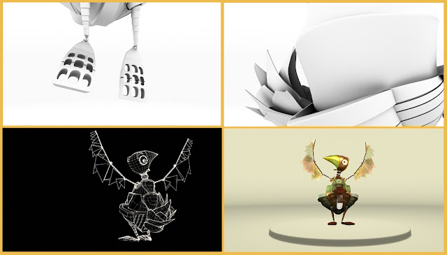
One of the brief's task was to create a showreel element using the elements of the project. I chose to take the main character and present it as an animated turnaround. These are some stills from the soon to be resolved showreel element:
Environment definition:
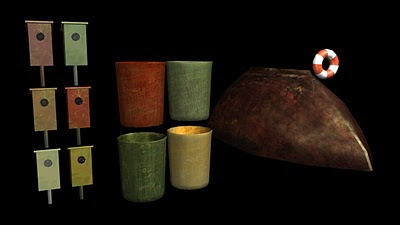
Also, as I said last week, I saw it neccesary to spend some time on details of the outside scene as before it looked dull even if all the major elements were brought in.
So I thought of bringing in these elements:
And so far it seems they really gave that much more to the scene. It is lot livelier to my mind. And, as I did in the first act, the scene will be pushed even further but this time only to specific scene requirements so to compliment the composition of the shot.
Personal Branding:
Next in line, is personal branding. I was working on logo designs from time to time. there were quite some cheesy ideas... here are some attempts of past few weeks.
this is one of the cheesy ones I've mentioned...
Then I came up with an idea to make an elephant from my initials. Well, if you asked me why elephant, I would say only, that they are my favourite animal from , as long as I remember myself and they are said to bring luck as well :]
However, for some reason the logo didn't feel as personal.. I think it fails to serve as my initial.
I gave it another go. Basically the following example has both of the previous initial design ideas as well as some flavour from the past ones I had. So it actually is a graphical development of my signatures yet still fresh. I felt this is perhaps the strongest ( or closest to me) personal logo.
And the business cards, brief asks to produce, would look like that:
Front side:
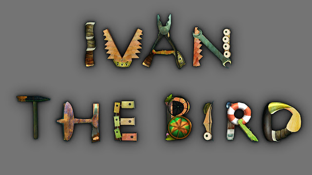
After 'excercising' with brand logos, and catching the right rithm for designing, I've also worked on title design which will be used for animation opening sequence also throughout other promotional materials. It did take quite some time in the day as the entire design is one big work on details ( what as some would agree, takes the longest in any work). But as I said it is a rewarding work, as it will be used extenisvely.
So the good rithm stayed and I went on designing the dvd cover and disc templates. I used the idea of demoreel presentation, as it really apealed to me.I like the 'clean' creamy/dreamy aesthetics in this one, as well as title fits in perfectly. Hopefully it feels a bit like a story-book cover as my entire project's idea was to make a story-bookish world , characters ect.
However the templates still need few renders from act 2 and 3. Also an 'epic' descriptive text.
Hope that's goint to help in the last week ( lets be honest, 3 days actually) before deadline.
In the mean time soundtrack designs for act , demoreel video, maya tutorials, some animation refining is still waiting to be finished for Thursday. this week best be the lucky one :D


Hey Jola,
ReplyDeleteLove the 'Ivan The Bird' font - great, but - and this is a discussion for a less busy week, so don't get distracted - I think your logo still needs finessing - personally, I think your thumbprint logo on the blog header is pretty much perfect already...
Yes I agree, I still prefer the original one better. But this was an opportunity to try and develope some new ideas
ReplyDelete